
Today, Valve released a new opt-in beta redesign of the Steam Workshop browsing experience, specifically to make mod discovery faster and more user-friendly across all devices. The test offers many quality-of-life improvements to browsing, including better layouts, responsiveness, and filtering.
When testing out ht Steam Workshop beta, you’ll now see that the browsing page utilizes more screen space, displaying more items per row with significantly larger preview images. Each item also has a magnifying glass icon that opens a preview mode where you can view screenshots, subscribe, favorite, or vote without leaving your current search results.
Filtering is much more efficient, as Valve has rewritten the filtering logic to be nearly instantaneous, allowing developers to configure “per-section” filters, ensuring you only see relevant options (e.g., filtering for maps vs. items). The entire interface has even been rebuilt to be mobile-friendly and optimized for the Steam Deck and Big Picture mode, addressing long-standing complaints about clunky handheld navigation.


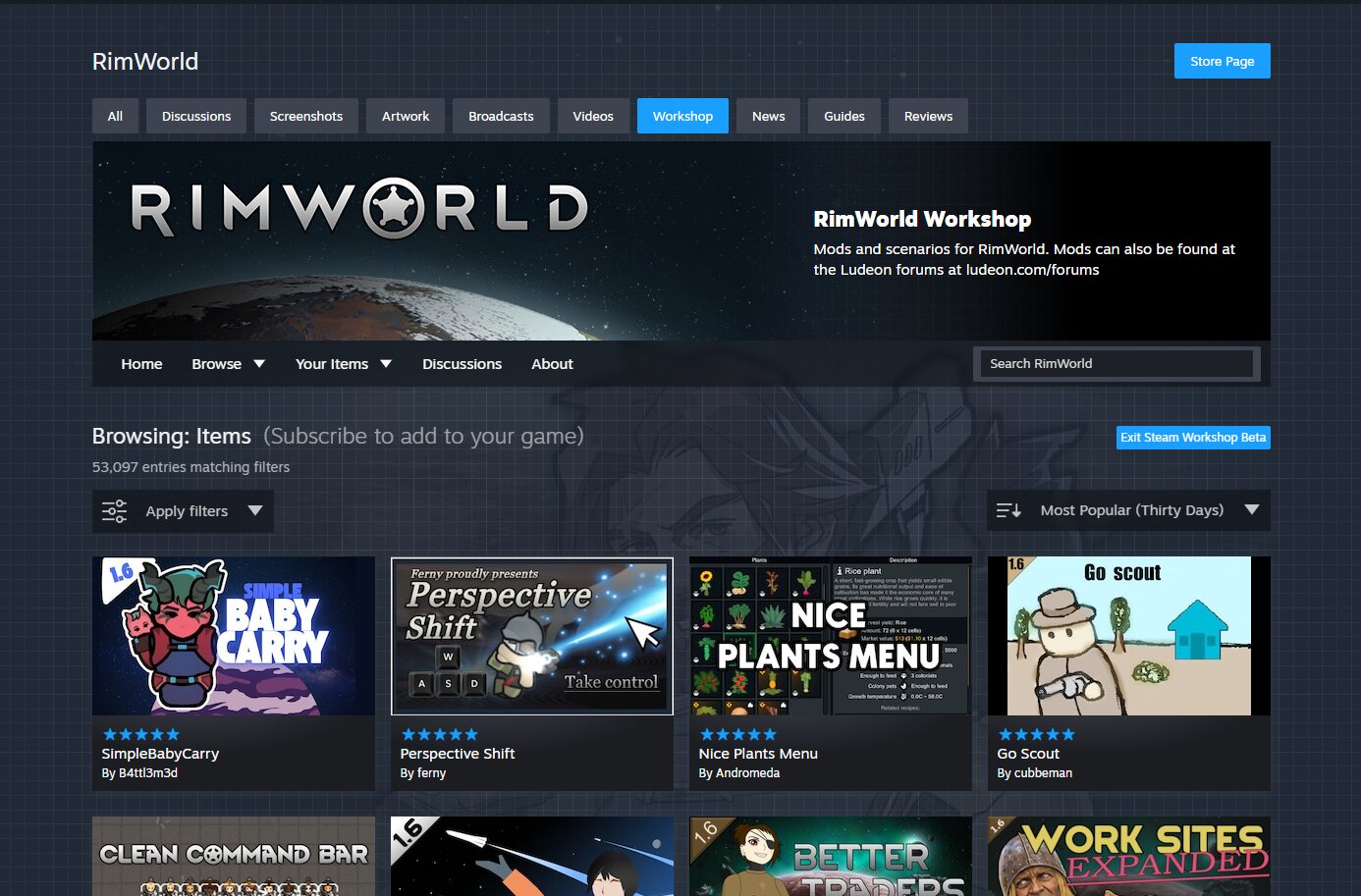
Anyone who is interested in trying the new features can access them immediately by navigating to any Workshop page and clicking the Enter Workshop Beta button at the top. Valve stated that this will run as a beta for a few weeks to a few months while they sort out the bugs and respond to feedback.
This is just one of the handful of pages they plan to update on the platform, though they don’t have an exact timeline or roadmap for which pages will be updated and when, only that updates will occur after the beta wraps up. Steam also recently launched its homepage redesign into beta, aiming to enhance the user experience by displaying more content and information.
For more up-to-date information about the Steam Workshop changes, upcoming sales, and other client updates, be sure to check back to Simulation Daily.


